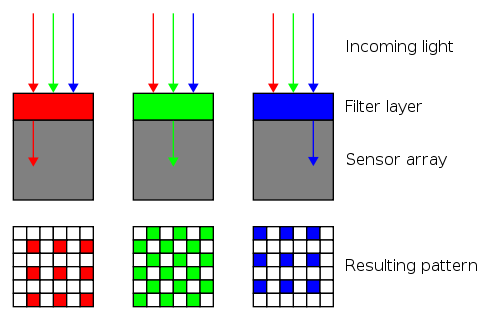
It starts when light hits the back of the camera. This is where the "megapixels" of the camera come in: each pixel, or tiny square of colour, corresponds to one of the camera's millions of sensors. Each sensor says how much light hit it.
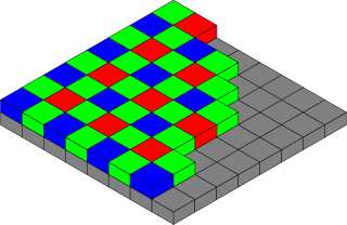
To tell "red" from "green" from "blue," there are colour filters on top of the sensors. That makes one sensor only capture "red" and the next only capture "green." Here's one 150,000th of a sensor array:
Diagrams © Colin M.L. Burnett, distributed under GFDL.
(Why is there twice as much green? Because the human eye notices differences in green more readily. Actually, the exact meaning of "red" and "green" and "blue" is different for every camera model. Manufacturers pick these colours carefully to make the best possible images.)
The sensors capture an image like this:
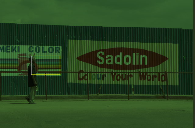
The image looks green because the camera captured twice as many green pixels. The image was squished to fit this web page; here's the same image zoomed in on the yellow square, which is 640 pixels wide and shown dot-for-dot:
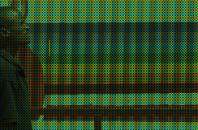
It looks a bit like a Monet painting. The effect is more obvious when zoomed in eight times more on the 80-pixel-wide yellow framed area:
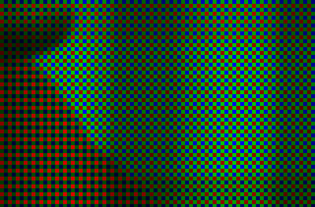
Clearly the camera captured one colour at a time. The green and blue pixels in the triangle at the bottom-left are dark, because the camera mostly captured red there. The parts with the brightest green, red and blue represent bright paint, captured one colour at a time.
There's a problem: the camera captured an unsightly image. Processing is needed to guess, or "interpolate," the other two colours per pixel.
The most obvious recipe is averages. For each green pixel, guess the amount of blue is the average from the blue pixels above and below, and guess the amount of red is the average from the red pixels to the left and right. And so on.
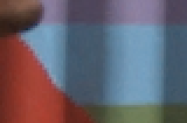
Computer scientists call this "bilinear interpolation" because the image is averaged in two directions, horizontally and vertically. After bilinear interpolation, the zoomed-in portion looks like this:

The result isn't great. There's a faint checkerboard pattern in the pixel row at the top of the horizontal green line. These patterns appear to varying degrees along sharp edges because some averaged colours incorporate pixels outside the edge while others don't.
The pixel-level inaccuracy can ruin pictures. For example, bilinear interpolation can add yellow edges to white picket fences.
There are more problems when zoomed pixel-for-pixel:
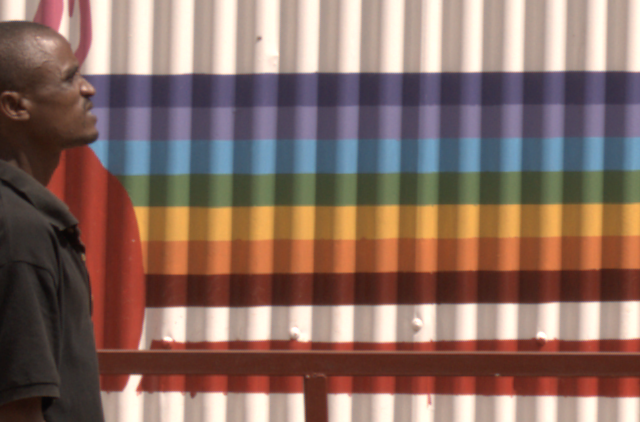
When the camera clicked, this picture was in focus. Now, the veins on the man's head look blurry, his chin is soft and the top of the railing behind him looks pinker than it should.
Digital cameras don't capture the colours of thin lines and they don't capture sharp edges. Photographers want these details anyway. Here's where purists switch back to film: digital photography is about making pictures look good, not accurate. The colour of the top of the railing can only be a guess.
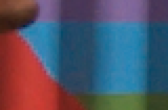
Enter "adaptive" interpolation, which treats some pixels differently than others. Here's the result of using "Adaptive Homogeneity-Directed interpolation" instead of bilinear interpolation. The AHD strategy is to choose, for each pixel, whether a horizontal, vertical or bilinear average will produce the least blurry result.

Notice the definition in the veins on the man's head and the darkness of his nostril. There's more clarity at the pixel level, too:
Edge pixels are more contrasted than their bilinear-interpolated brethren, and there aren't any checkerboards.
The bilinear strategy and the AHD strategy guessed differently about what the camera missed. Nobody can assert one image is closer to reality than the other. But most would agree the AHD-interpolated image, which has sharper edges and fewer out-of-place colours, looks better.
Speaking of looking better, there's one last step. As mentioned before, "red" and "green" and "blue" are different for each camera model. The colours need to be adjusted into the red and green and blue most computers expect. It's tedious math with vibrant results.
The colours are more vivid. Now all that's left is to zoom out:
Digital cameras do this sort of processing as they capture every picture when they're outputting JPEG files. Some more expensive digital cameras can save "RAW" files instead. One advantage of saving as RAW is that the camera doesn't need to interpolate instantly. A computer can interpolate later, so the photographer can choose a slow process like AHD when there's more time to pay attention to detail.
Click the row and column headers to zoom and interpolate:
Technical details:
- Camera: Nikon D5000 with kit 18-55mm lens.
- Software: custom programs built with refinery, based on its util/raw2ppm.cc.
- Colour space of final image: sRGB.
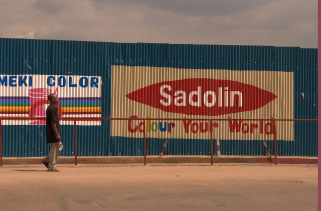
- Photo caption: A man walks on a downtown Kigali street.
- The vertical grey band at the right of the zoomed-out image is an artifact the Nikon D5000 sensor captures with every shot. It is retained for completeness.